First Day Art 2 Assignments
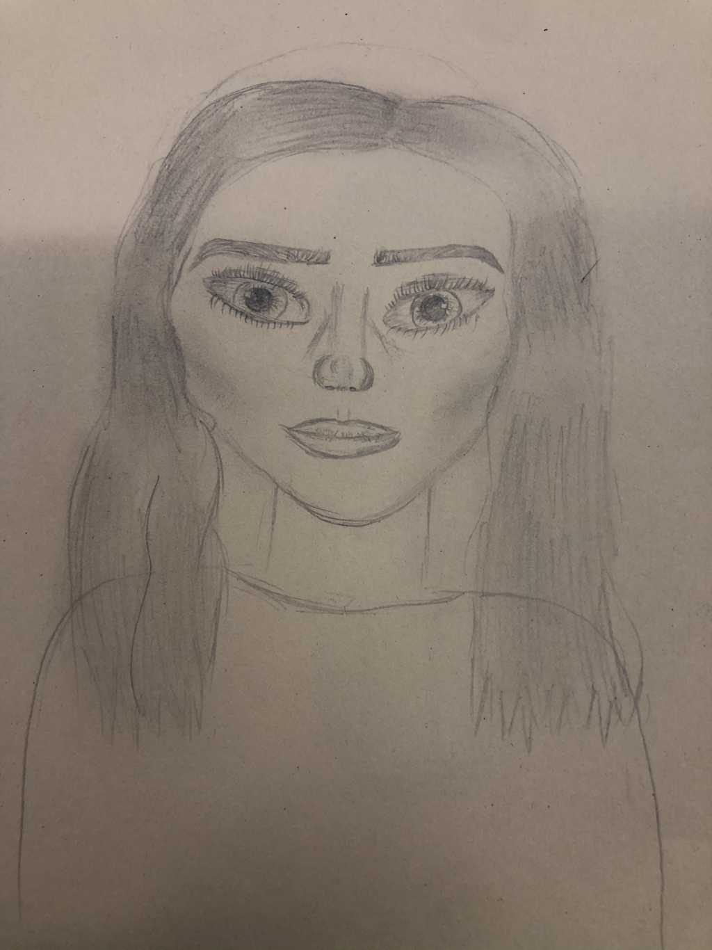
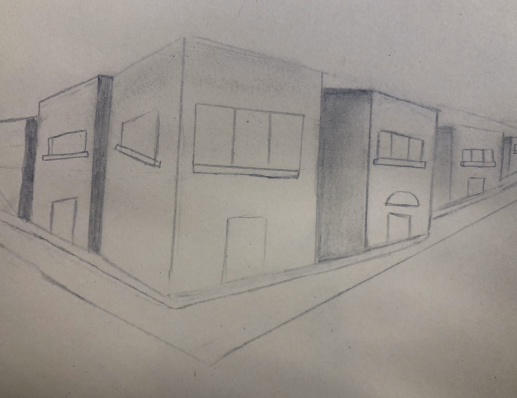
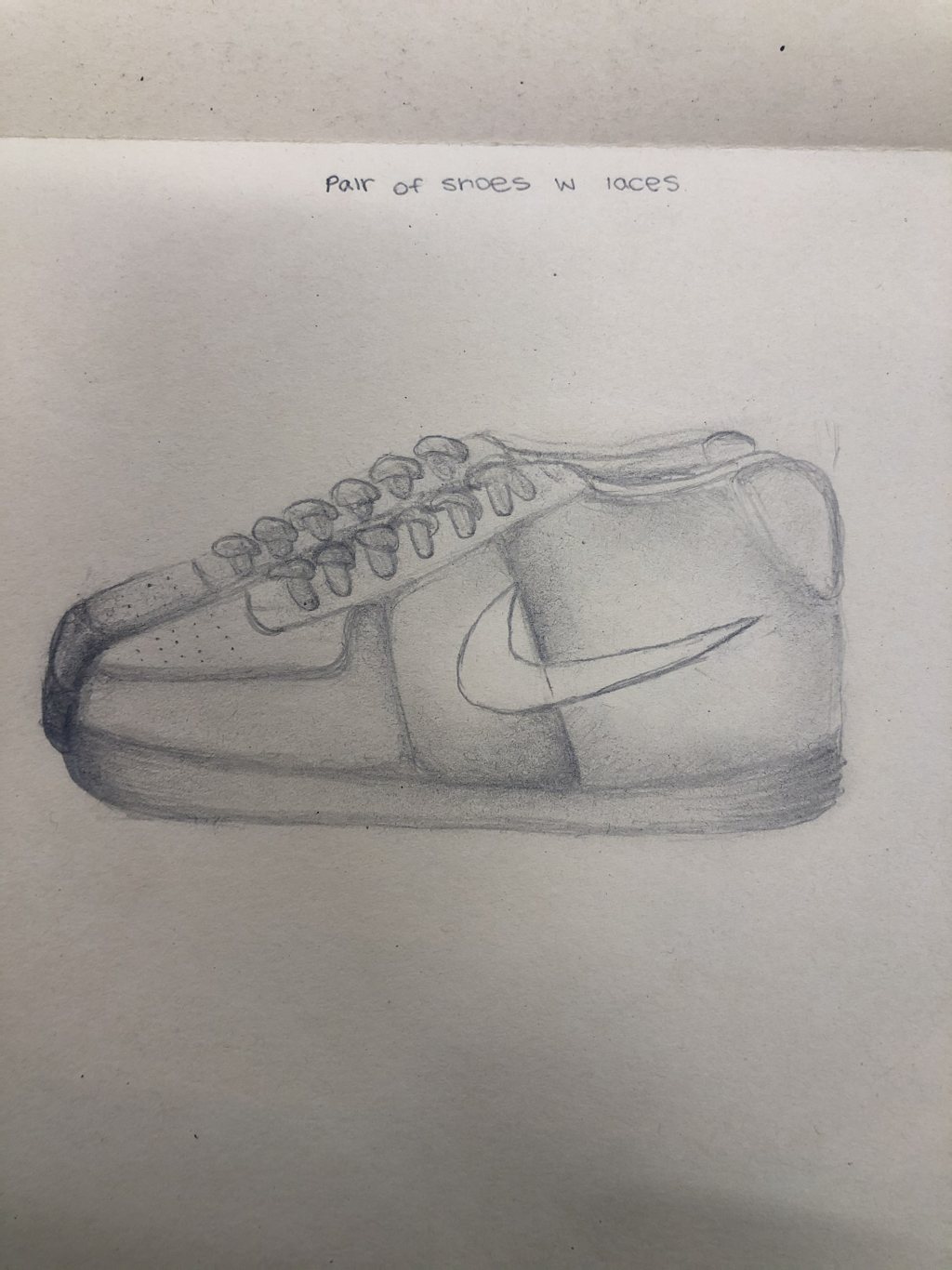
The assignment we had to complete was 4 different sketches to show our current art skills. We had to draw a pair of shoes with laces, a self portrait, a two point perspective, and a hand.
|
|
|
|
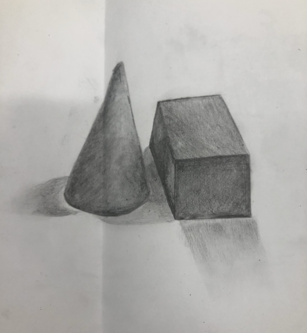
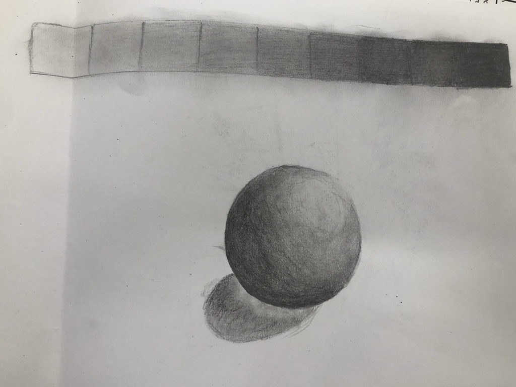
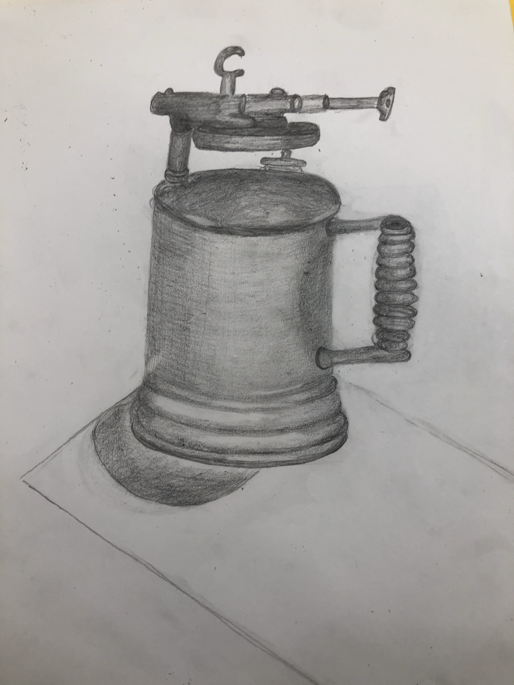
Shading
For this assignment we were given objects to draw. We had to show our knowledge of shading and highlights. This was our assessment drawing to show how we are able to use shading on a more complicated object than a cube or cone. We started off shading cones and spheres and even a value chart as I inserted on the bottom of the page. We ended up with a more complicated drawing incorporating all of the things we practiced.
|
|
|
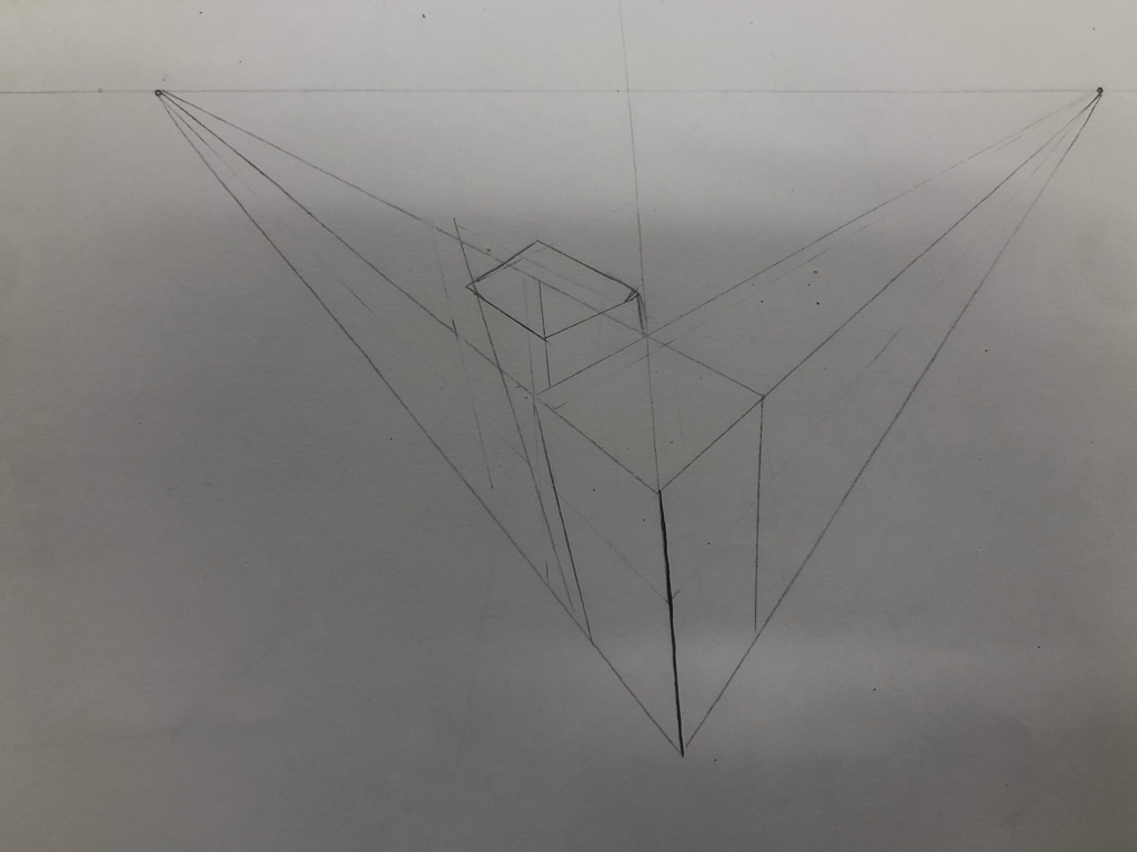
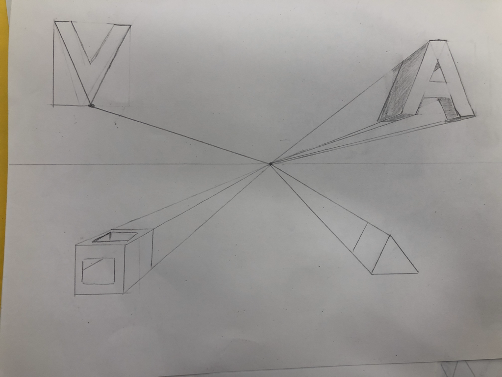
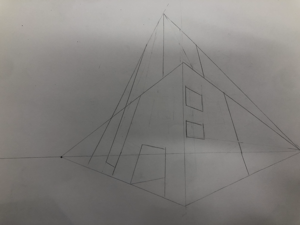
Perspectives
This assignment was to practice perspective we started off with practice on drawing shapes and letters in different perspectives (those are the first pictures). The last picture is our final LEGO perspective. First we built a lego structure and took pictures of it for reference. After we took the pictures our assignment was to print them and draw the picture we chose. The last picture is my final LEGO drawing.
|


|
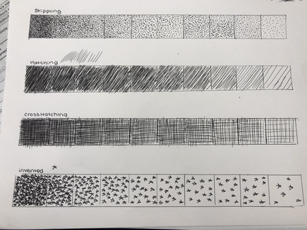
Pen and ink
This is my pen and ink assignment we had to watch videos and sketch the different types of techniques. My sketches include a technique value chart and the videos I watched.
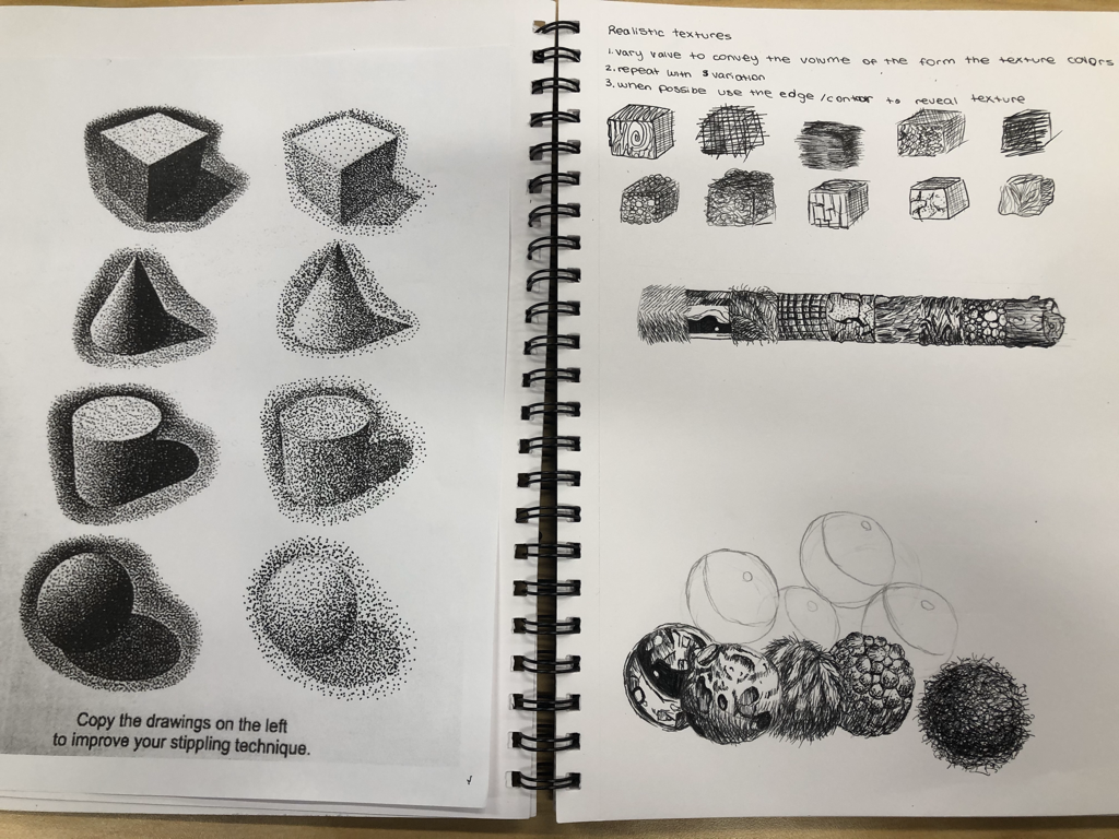
On my final drawing I chose to use many techniques this was to create variety and texture. For example, on the leaves and grass I used a different texture than I used on the house this was to create a more realistic texture. I used stippling on the house to add texture but not overpower the rest. I used hatching for the leaves and grass to make it look more natural. In my drawing I used perspective by showing the side of the house. Perspective is very important because it shows a different view of something and my drawing shows a house from an unusual perspective adding a non traditional affect. Texture is very important in my drawing because without the variety in texture it would all look the same. Value is also very important because it adds to the affect of how close something is and adds to the variety of texture. My craftsmanship was good I created an idea that I recreated and added to as I developed it more. If I was to recreate this project I would have made it more modern. I think as I added more plants and textures the modern look went away more. When applying the pen and ink techniques it’s important to understand the concepts taught in class so that you can apply them well and correctly for example knowing when to use the certain techniques to add more value and varying textures. From this project I learned how to draw with different perspectives I can use lines to create point perspective now correctly and I learned about new techniques that I can add in other drawings and apply when using other tools such as colored pencils.
References:
|
|
Prismacolor

|
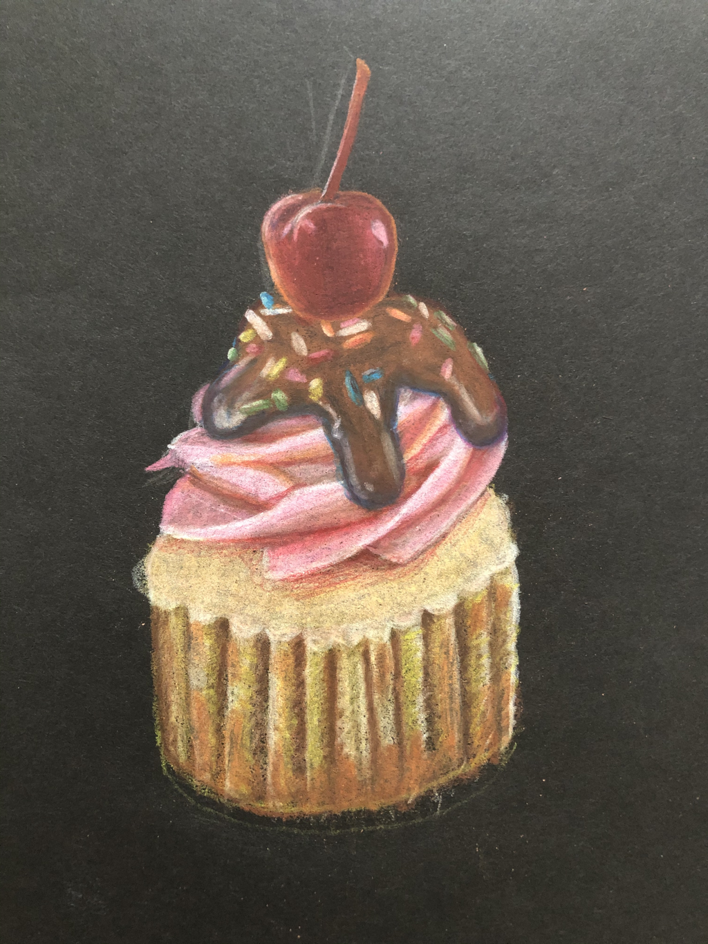
↑above are my cupcake and my woven practice sheet. ↑
|
|
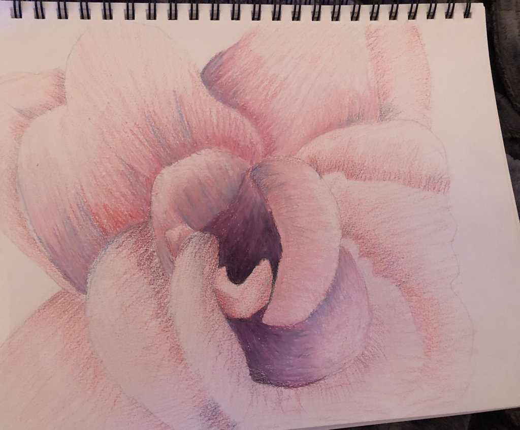
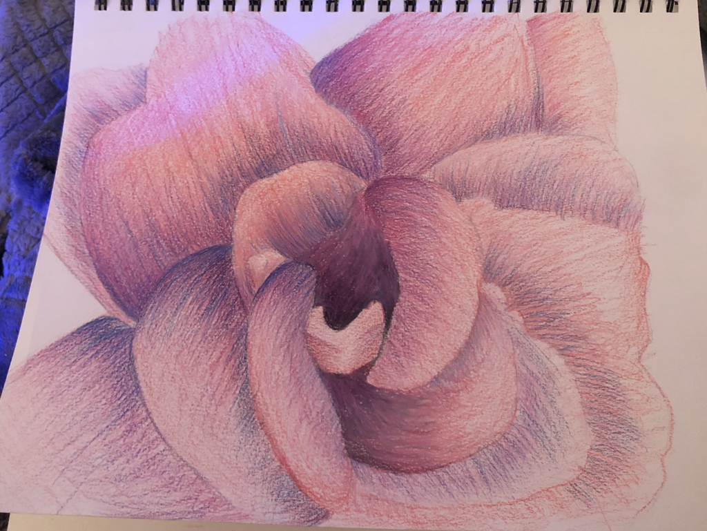
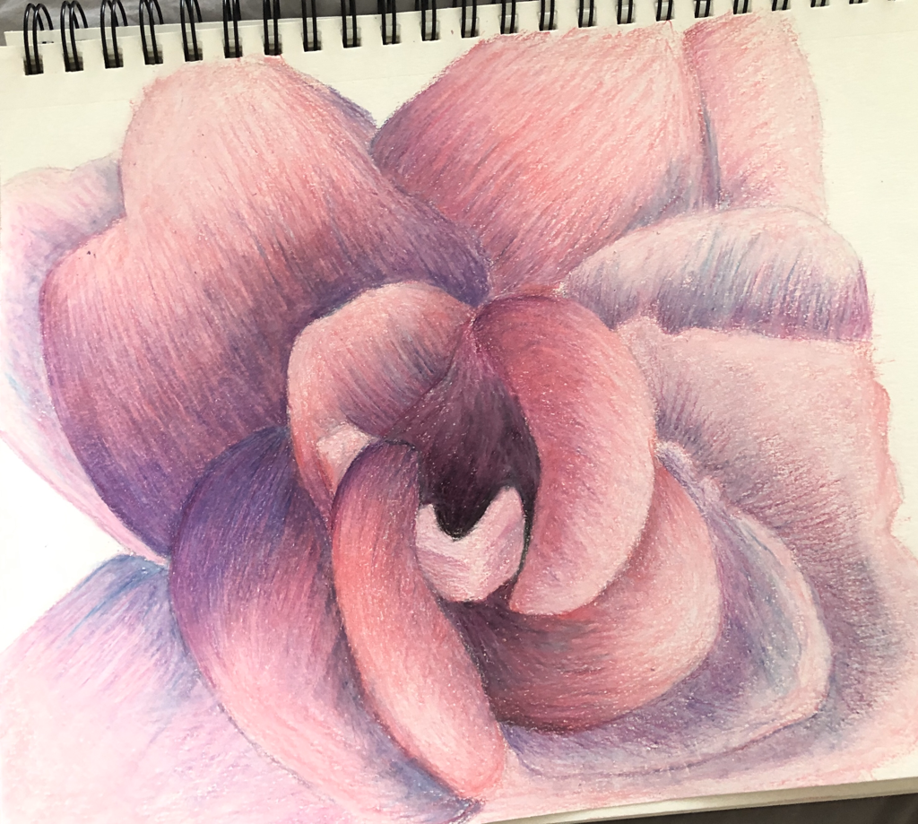
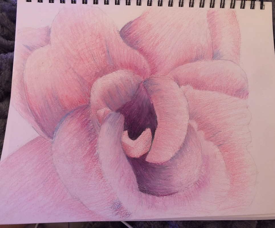
1. The craftsmanship of my drawing is pretty neat and well executed I tried to do my best but I got pretty frustrated with how it turned out because it wasn’t turning out the way I wanted.
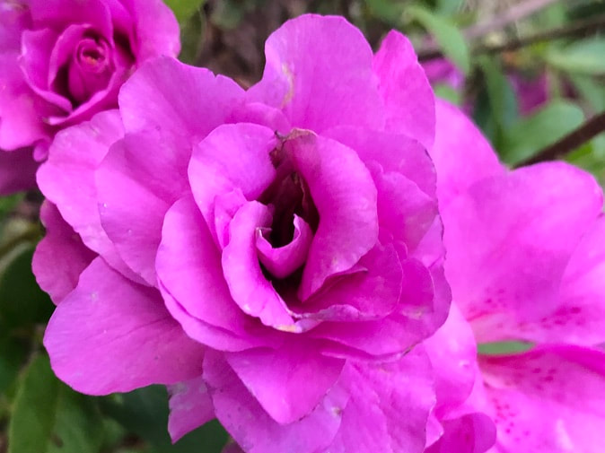
2. I think I used a full range of values to create the illusion of depth because I used blacks and purples to make it seem like the flower had shadows. 3. I think I represented the style of George O’Kreeffe because I drew a flower with many values filling the whole page. 4. The choice of color and color harmonies that I used in my artwork were purple and pink and some blues to add depth because I thought the darker purples and darker blues would help create texture and movement. 5. I created contrast because I added darker colors meeting the lighter colors at the end of petals To contrast each petal. 6. are use textures when I added blues because I thought it would create a more Griddy texture as the original photo. I created highlights by adding very little pinks to the end of the petals and I use the darker colors to make it seem like the center of the flower how to shadow to enhance the depth of the drawing. 7. I had difficulties blending at one point I think I could change this by layering more since It got frustrating getting the exact blending I wanted. 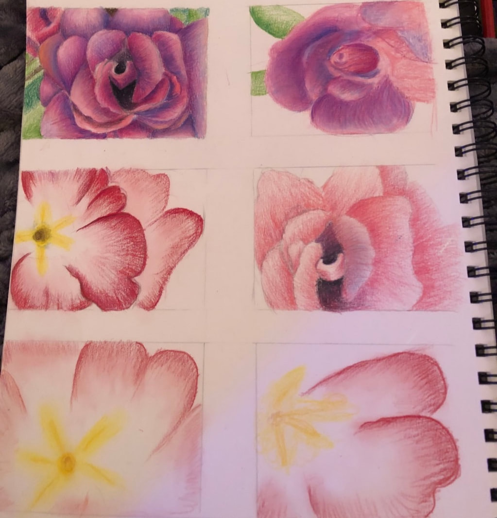
Reference:
|
|
